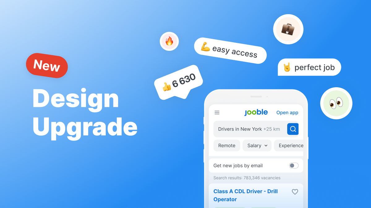
We’re delighted to present the revamp of our website, a redesign that delves deeper than surface changes to enhance the user experience for our visitors.
While we’ve refreshed the visual aesthetics to reflect modern trends, our primary objective extends beyond mere appearances – we’re committed to creating a seamless and purpose-driven journey for every user.
At the core of our company’s strategy lies the dedication to becoming the ultimate “gateway” or comprehensive resource, directing individuals towards the best career opportunities that match their unique skills, beliefs, values, and requirements.
With the expansion of our service offerings, it became obvious that a redesign was essential to align our platform with this ambitious vision. Refreshing Navigation
In light of the evolving scope of our services, we’ve redesigned the entire navigation framework of our product. The primary alterations involve the main menu and the search and filter functionalities. The primary navigation has been relocated to a streamlined sidebar on the left, ensuring visibility and convenient access.
Now, users can effortlessly locate:
Termed as “shelves” internally for our services, this updated navigation streamlines the user experience, making it more intuitive to explore the offerings that will steer users towards their ideal jobs.
Read also: From Metrics to Mastery: Unveiling New Jooble Tools to Refine Your Campaigns
Filters below the search bar
Configuring filters for job searches is crucial for securing the ideal role. Previously, filters were situated in the left panel, but we have relocated them directly beneath the search bar.

Users can now apply these filters conveniently from the top of the site, just below the search bar:
Upgraded job preview
Following the update, users can access additional vital details regarding the role and its perks in the job preview, resulting in significant time savings during the search.
Over the year, we conducted numerous experiments to refine job previews. As a result, more crucial benefit points are now readily visible in the preview, enabling users to save time by not having to click on the vacancy to locate these features. This enhancement facilitates quicker discovery of appealing job openings.
For instance:
Enhanced user experience
Our revamped service categories aren’t just about looks; they’re integral to our approach. By simplifying access to our services, users can easily choose the tools they require to secure the ideal job.

These services delve into the user’s preferences, offering customised suggestions for more pertinent job opportunities.
For instance, there’s the Salary section, where you can discover:
Jooble Helps Find Ideal Job
Jooble’s updated website enhances the job-searching experience by enabling easy customisation of searches by date, job type, experience, location, and salary. Our filters now sit conveniently below the search bar.
Our service sections are crafted to grasp candidates’ needs, offering personalised suggestions based on user preferences and facilitating the exploration of top job opportunities with greater ease.
We’ve made improvements to ensure a smoother and more enjoyable job hunt. With Jooble’s enhanced website, we’re committed to delivering the ultimate candidate experience from beginning to end.
Read also: Unlock New Opportunities with Jooble: Analyze Campaigns in Your Personal Account


